Features
music streaming ui
Experience on-demand
text-activation
auto-play
manual scroll
jump to topic
Problem
The average adult attention span ranges from 8 to 20 minutes. With mobile interface and text-heavy content that figure is even less. While interviewing 3 individuals who have visited an art museum at least 2 times in the past year, all articulated a similar perspective:
Most resources for learning about art can feel too dense or academic, there is a need for something simpler.
opportunity
Research suggests that listening to audiobooks can generally help improve focus and attention span due to the immersive nature of narration, allowing listeners to engage with the story while doing other activities. Short, narrated tours became the focus of Artefact's design. This is the user journey I visualized.
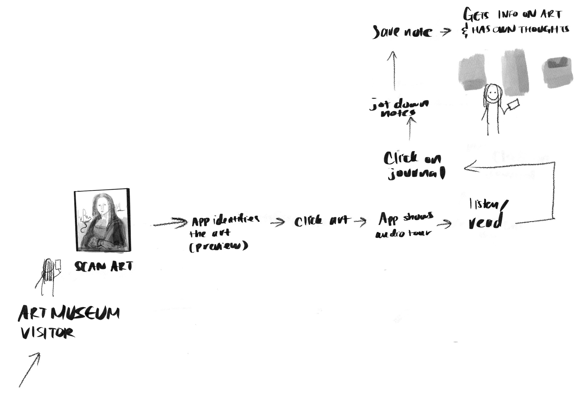
a museum visitor's journey with artefact
Each step is as immersive as possible and conducive to multi-tasking
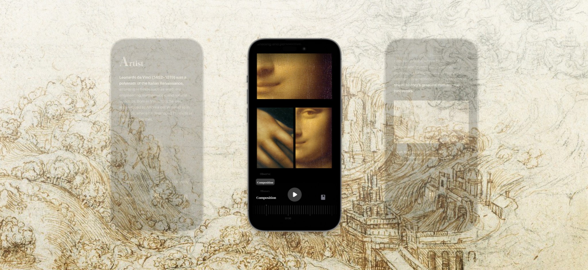
For the overall UI, I researched adjacent industries: Music and Reading. I was particularly inspired by Spotify and Libby, where immersion and readability are core to the experience. I found that a combination of visuals and text is the most effective way to convey dense information. I applied these learnings to the user flow.
Research inspired storyboard
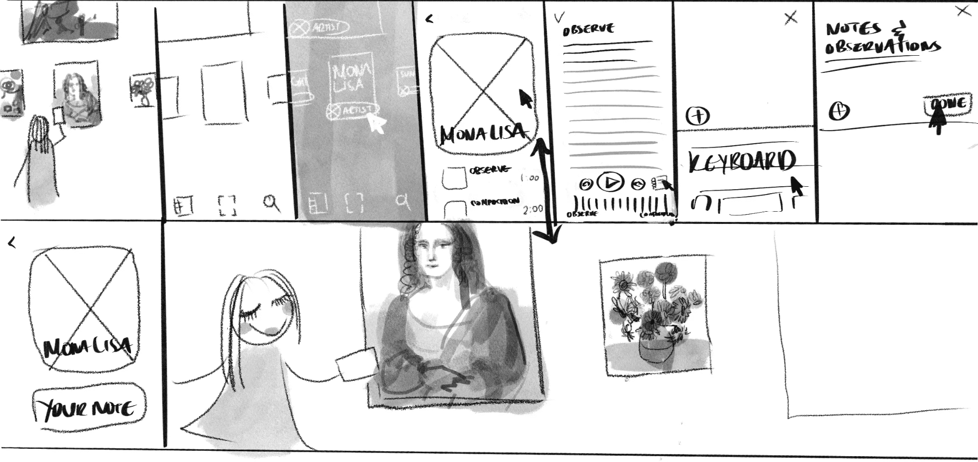
Initial design sketches in context of the Artefact experience I envision
solution
Given the condensed timeline, I focused on the audio tour. This was the result.
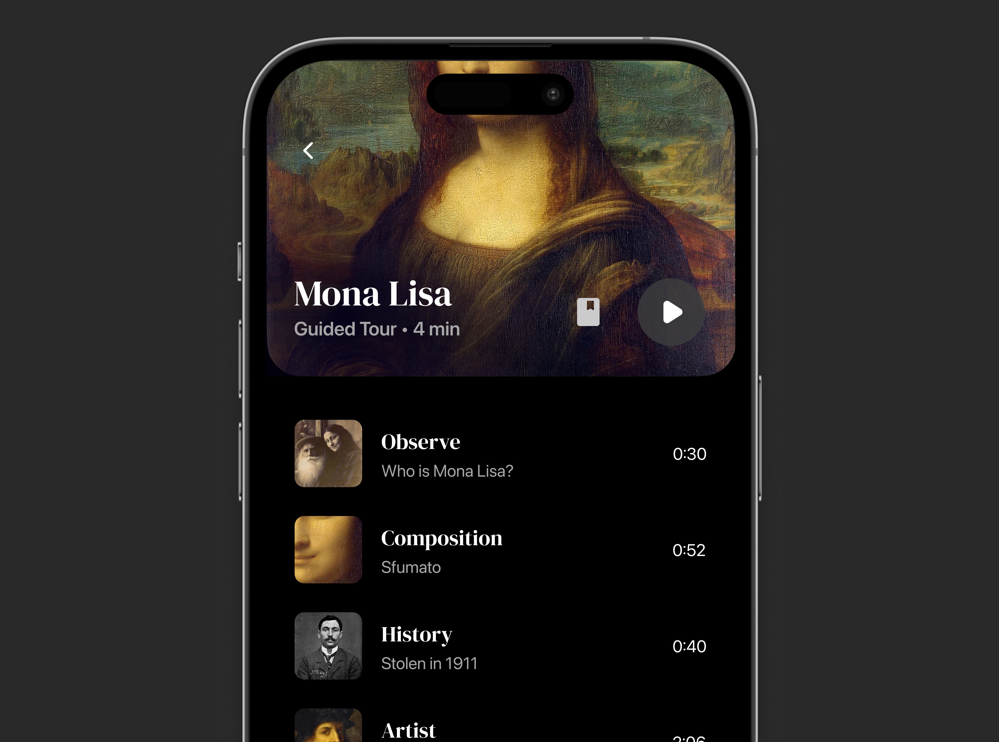
music streaming ui
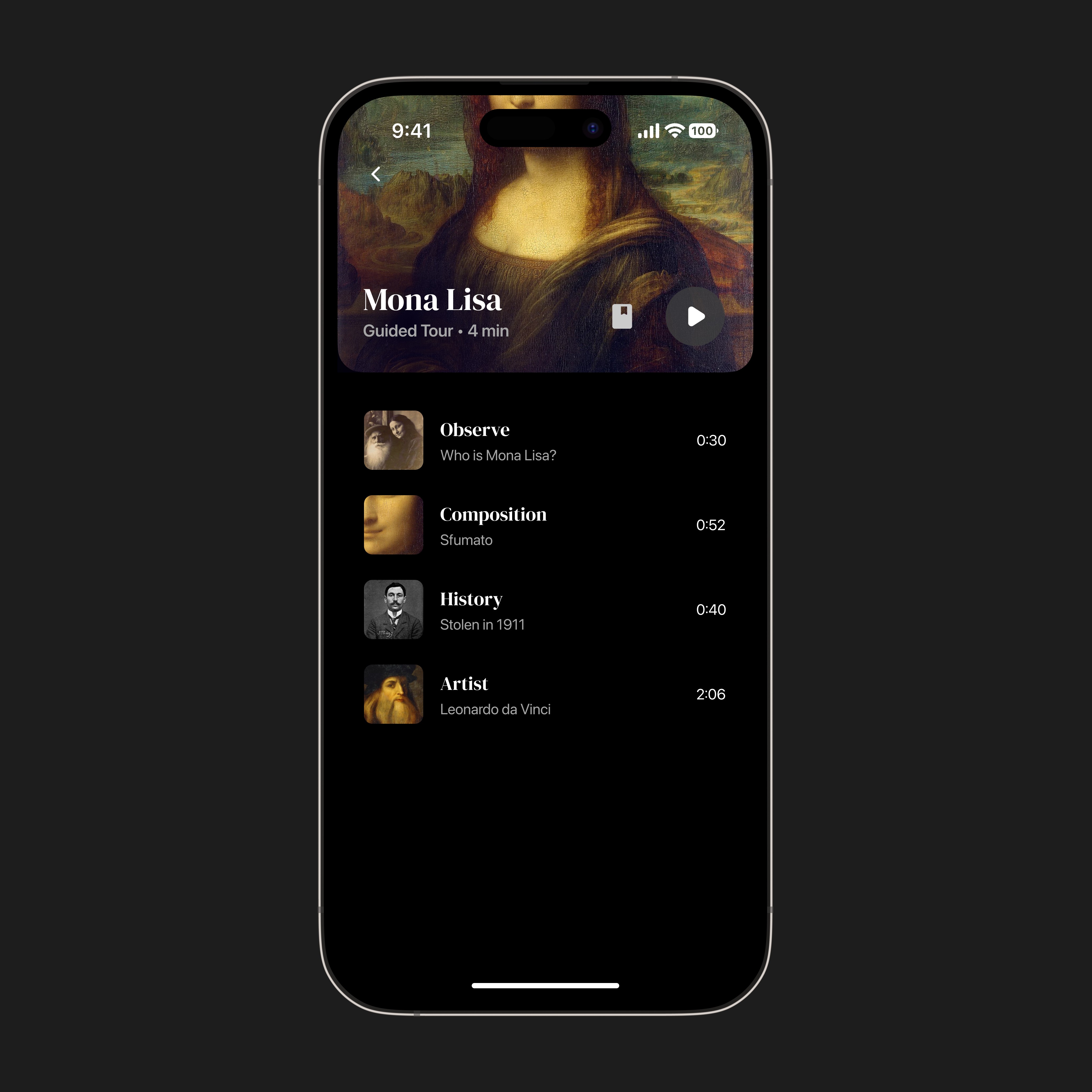
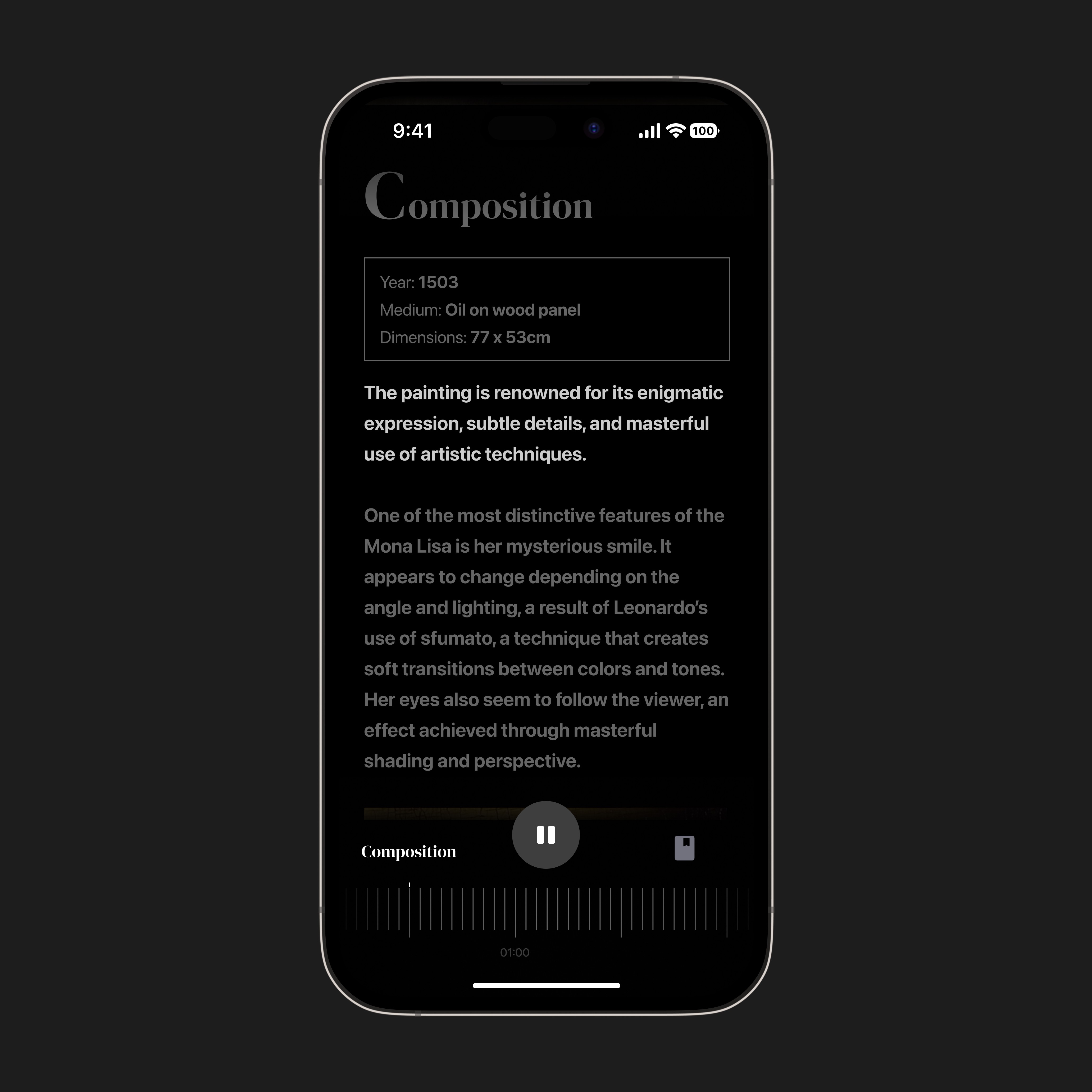
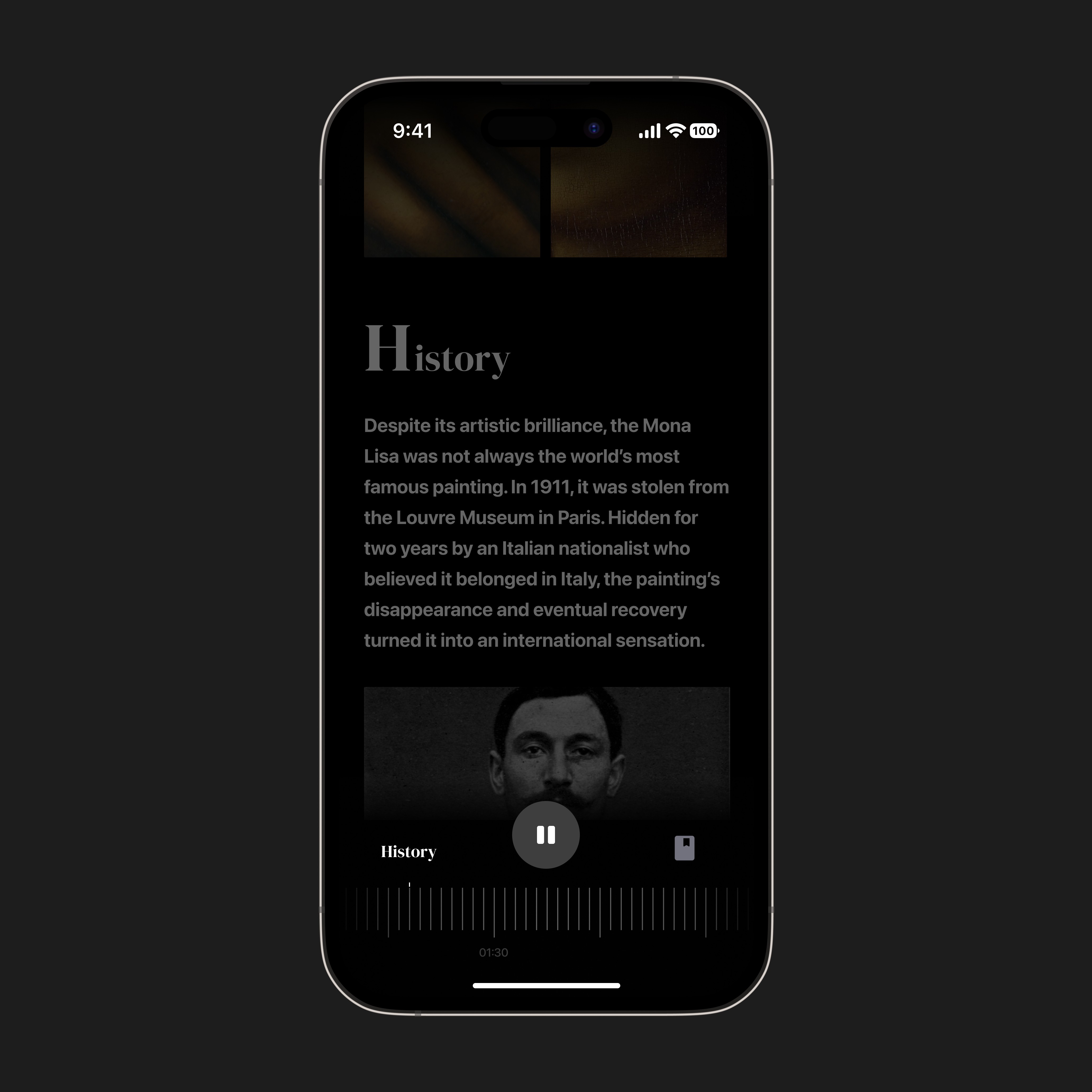
Playlist design for topics covered. Content occupies the majority of the viewport, with primary actions and a progress tracker in the footer. Iterations boosted legibility and navigation by leveraging familiar UI elements
Experience on-demand
The main page offers affordances for secondary information. The play button and journal feature are always within the user's sightline

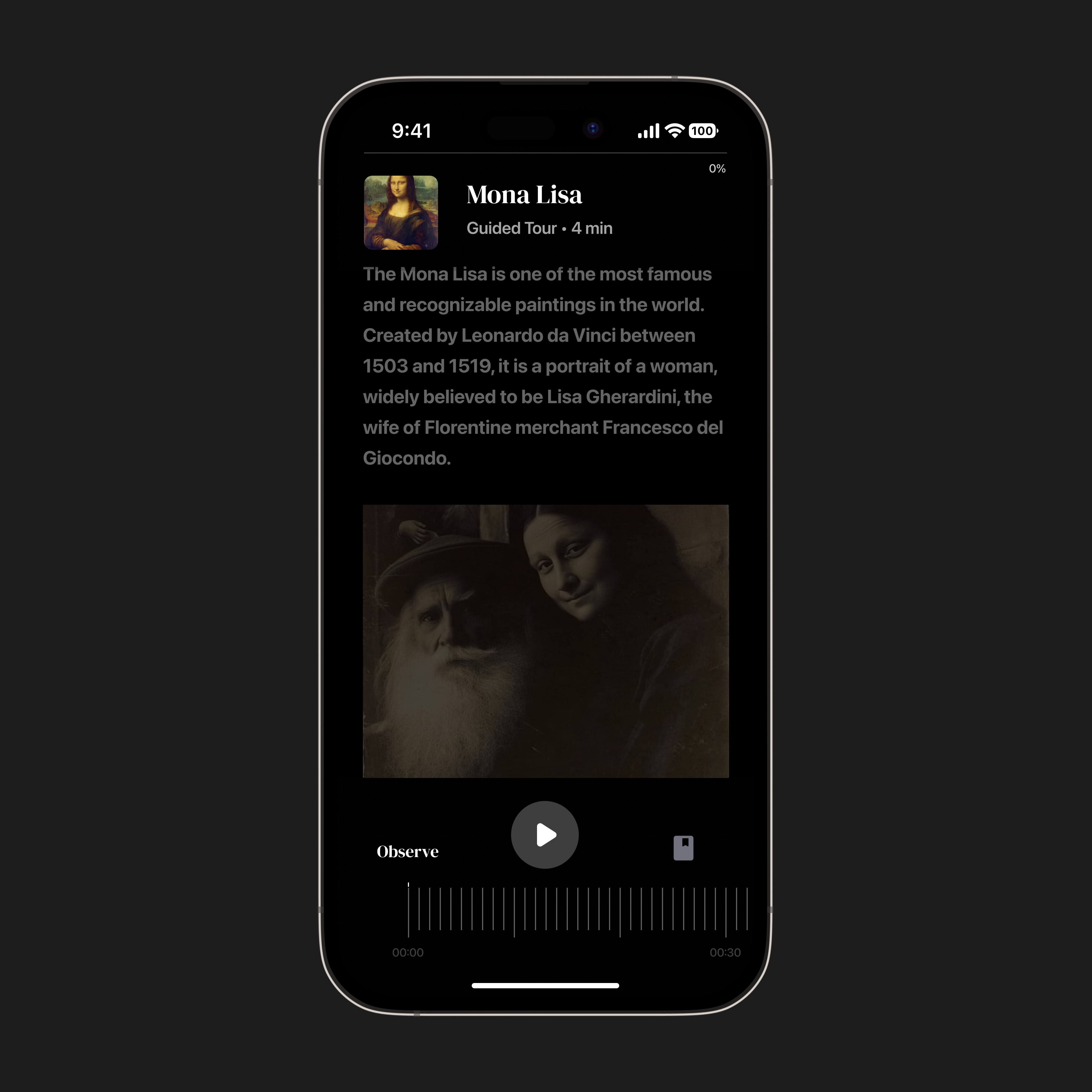
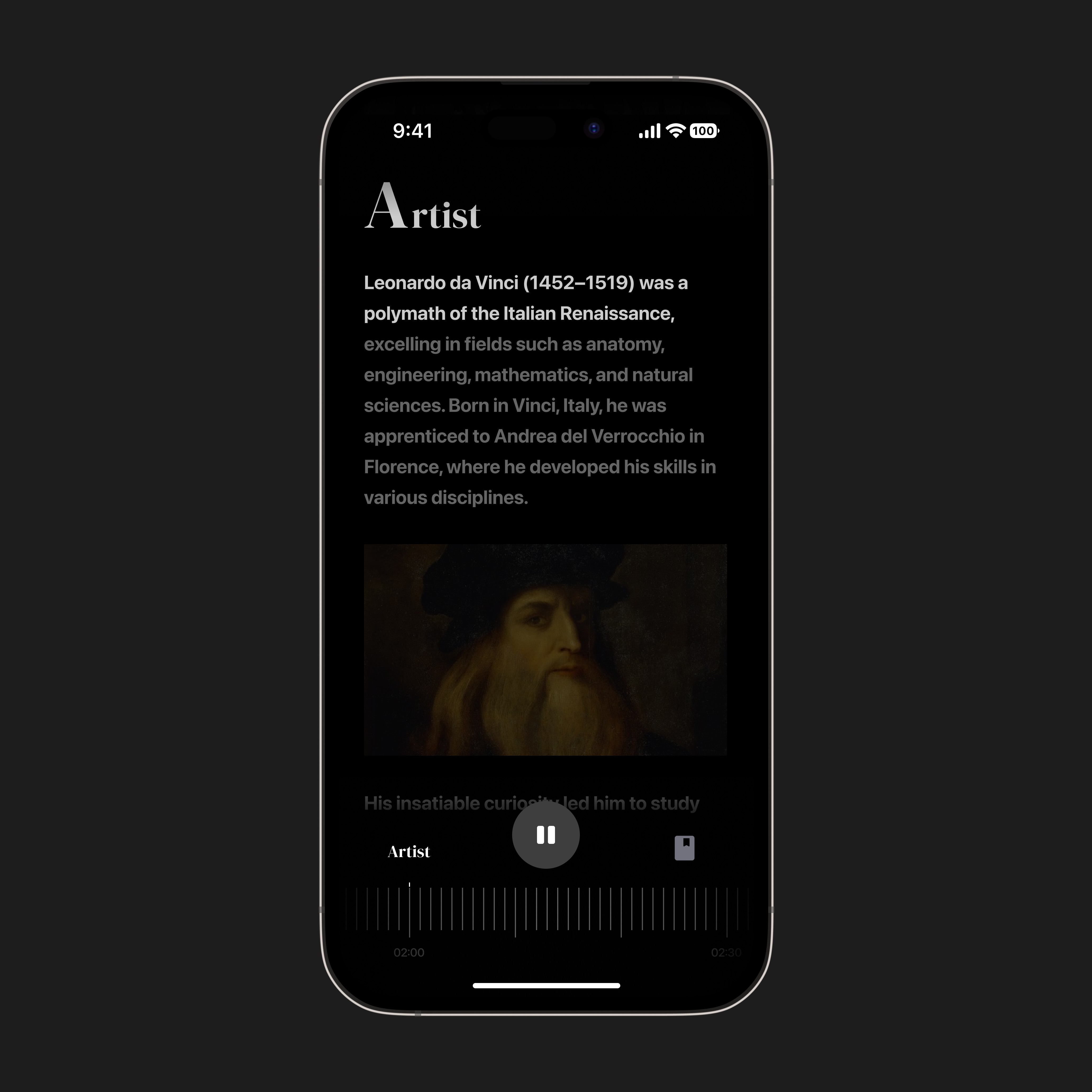
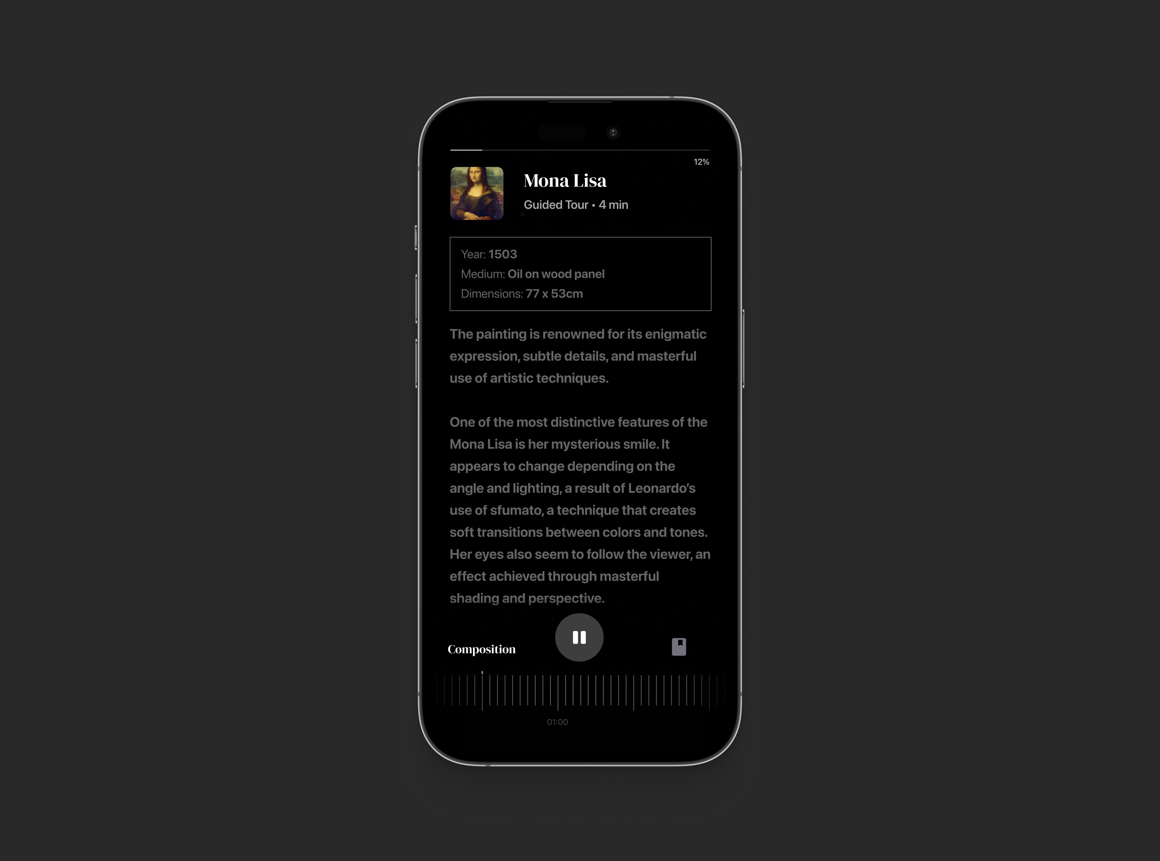
Text-Activation improves comprehension
Text is illuminated in sync with the narration. Topic headers and body text are distinct but harmonious
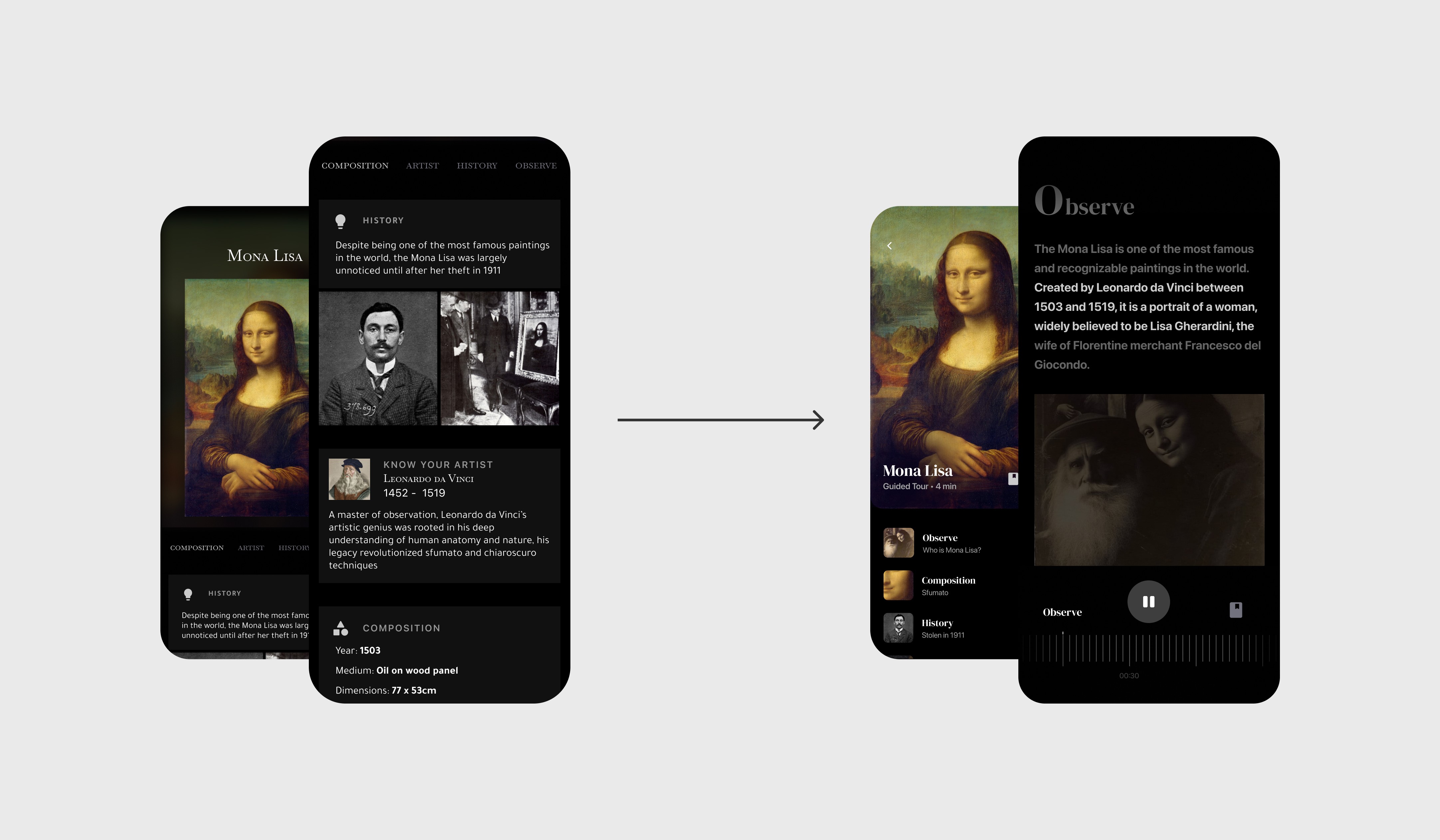
Recognizing that users have different engagement styles, I made navigation flexibility paramount. I took inspiration from Spotify for the interaction design:
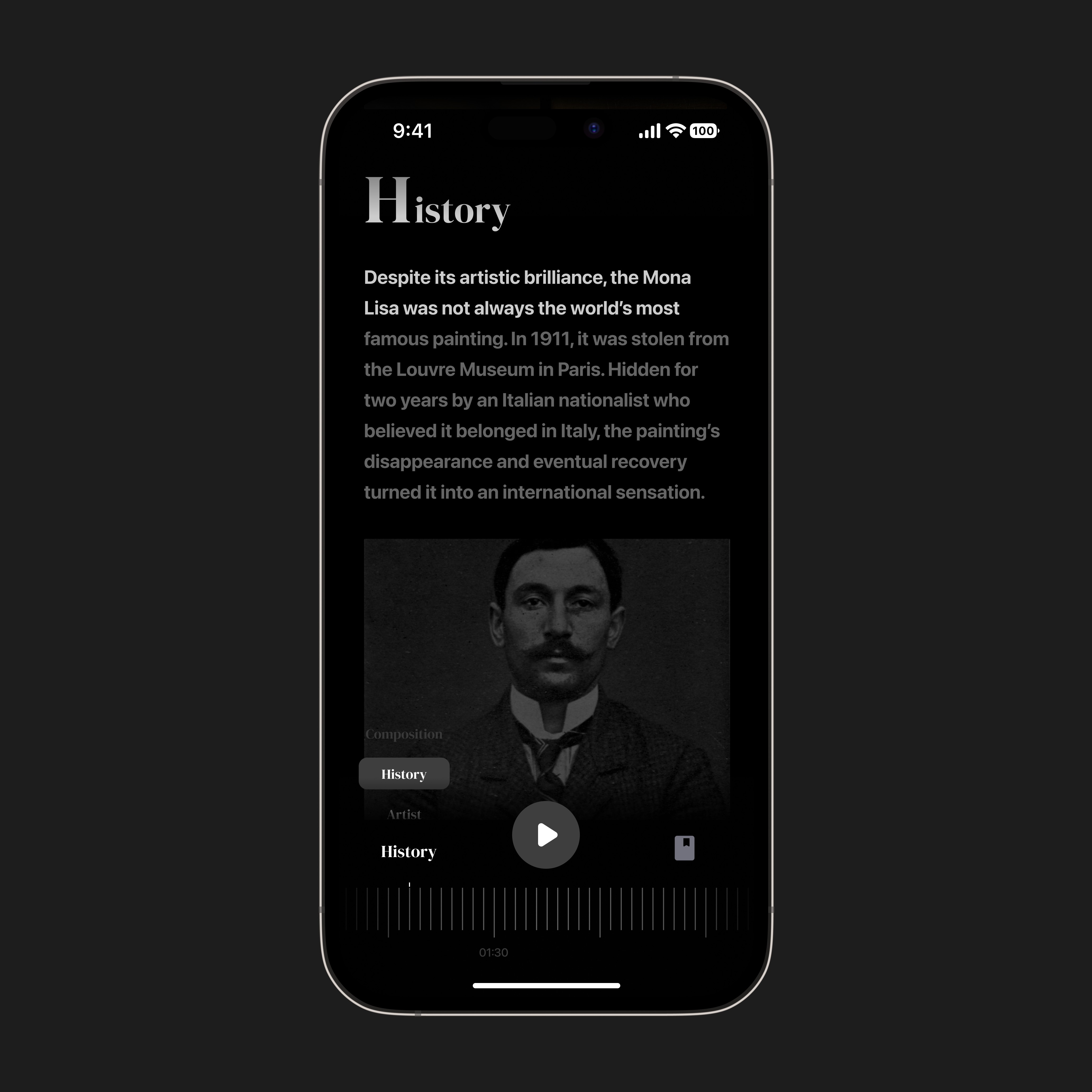
Auto-play
Default interaction while tracker reflects progression in real-time
Manual Scroll
Affordances to preview and advance the tour at the user's preferred pace
jump to a topic
Navigate directly to a section with one click, bypassing unnecessary scrolling
All navigation features are in-step with each other making the overall experience fluid and intuitive.
next steps
This was my take on a design sprint, where limited time and resources required me to prioritize key features in my designs. I would have liked to build out the rest of the user’s journey from scanning artwork with Augmented Reality to integrating a journaling feature where users could document their thoughts and make the experience more engaging.
Through designing Artefact, I learned the importance of accommodating different user preferences and how offering varied interactions can maximize usability. I also discovered that as interactions increase, it becomes critical to ensure they seamlessly connect to avoid confusion and maintain a cohesive experience.
Ultimately, Artefact was a rewarding challenge exploring how intentional designs can democratize learning.